
High-Converting Landing Pages: The Step-by-Step Formula to Transform Visitors Into Quality Leads
Discover the essential elements of a high-converting landing page and how to turn your lead magnet into a powerful list-building engine.
Most lead magnets don’t fail because they’re weak—they fail because they’re introduced poorly.
You might have the most irresistible free resource in your market, but if your landing page is cluttered, unclear, or trying to do too much, your conversion rate will quietly collapse.
Here’s the uncomfortable truth: landing pages aren’t a design problem—they’re a decision problem.
Why Most Landing Pages Underperform
Many founders mistakenly treat landing pages like mini-websites, cramming in navigation bars, multiple CTAs, lengthy explanations, and excessive branding.
But a landing page has only one job: help the right visitor say “yes” without friction.
In fact, Unbounce reports that removing distractions such as navigation can boost conversions by up to 30%.
Clarity converts. Options confuse.
The Attention Economy Reality
Visitors don’t arrive curious—they arrive distracted. Microsoft research shows the average attention span is now just 8 seconds.
Your landing page must:
Orientinstantly
Prove relevance immediately
Eliminate friction
A high-converting landing page doesn’t persuade slowly—it aligns in a moment.
The Anatomy of a High-Converting Lead Magnet Page
Let’s focus on what actually gets results, not just what looks impressive.
1. A Headline That Finishes the Reader’s Thought
Your headline should answer one key question:
“Is this for me?”
Effective headlines are:
Outcome-focused
Specific
Emotionally resonant
Example:
“Steal the Exact Follow-Up Email That Turns ‘I’ll Think About It’ Into Yes.”
As Copyblogger says, clarity always beats cleverness.
2. Bulleted Benefits (Not Features)
People don’t want PDFs—they want relief.
Instead of:
“20-page guide” Try:
“Know exactly what to say next—without second-guessing.”
According to Nielsen Norman Group, scannable bullet points dramatically improve comprehension.
If it can’t be understood in 5 seconds, it won’t convert.
3. One Visual That Anchors Value
Your image should do one thing: make the offer feel real.
This could be:
A clean mockup
A checklist preview
A worksheet snapshot
CXL notes that visuals increase perceived value—but only when they reinforce clarity.
No stock photos. No decorative clutter.
4. A Single, Frictionless Opt-In
High-converting pages ask for:
One action
Minimal information
Requesting only an email usually outperforms asking for email + names.
Every extra field is a silent “no.”
The Strategic Reframe: Landing Pages as Digital Pathways
Your landing page isn’t a pitch—it’s a path.
It guides visitors through a journey:
Curiosity → Recognition → Commitment
When crafted well, this journey feels effortless.
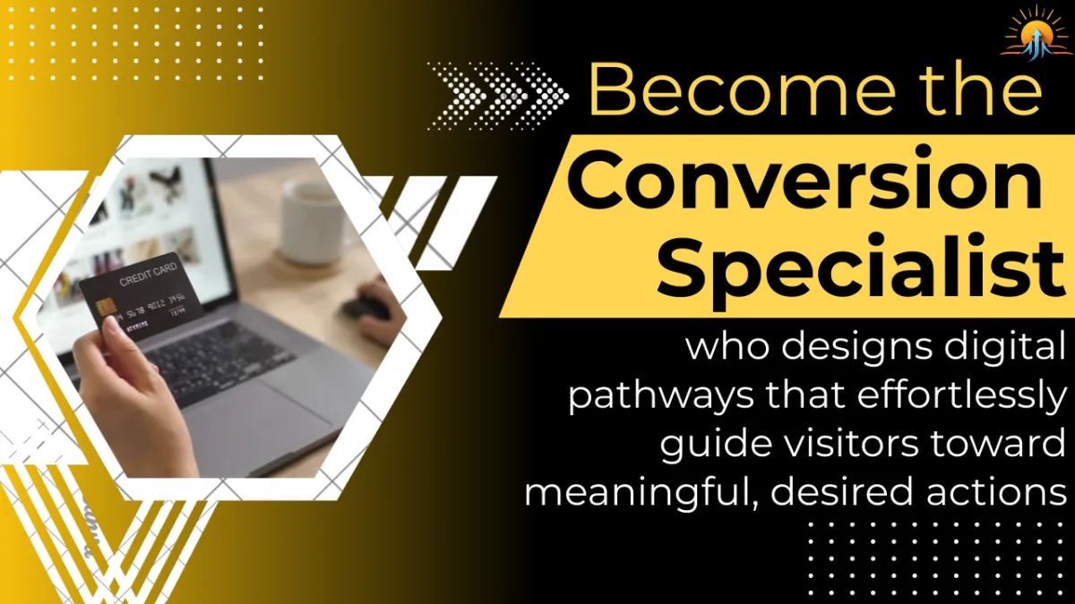
That’s when you become The Conversion Specialist—a leader who creates experiences that honor attention, time, and intent.
The Cost of Inaction (The Quiet Conversion Leak)
Sending traffic to unfocused pages has hidden costs:
Rising ad expenses
List growth that stalls
Top leads slipping away unnoticed
Your expertise undervalued
The real tragedy isn’t low traffic—it’s wasted attention.
Your Move
Before launching another lead magnet, ask yourself one ruthless question:
“Is this page helping one person make one clear decision?”
If the answer is no, simplify.
The fastest way to grow your list isn’t more content—it’s better conversion.
♻️ Your insights matter! Share this publication to help your network move beyond surface-level marketing and empower more leaders to implement systems that create real, lasting impact.
Ready to level up your marketing? 𝐕𝐢𝐬𝐢𝐭 𝐨𝐮𝐫 𝐰𝐞𝐛𝐬𝐢𝐭𝐞 👉 https://newdawntransformation.com/ for proven, system-focused strategies and practical insights you can use immediately. Your next breakthrough starts today!
#BusinessSystems #ThoughtLeadership
